If less really is more, did BT get its new logo right?
As BT underwhelms with its new brand design, Harry Lang asks how important investment is in an exciting logo and whether there is such a thing as ‘too simple’.
 By Harry Lang
![]()
BT, the institutional multinational telecoms group formerly known as ‘British Telecom’, is the latest conglomerate to inject some life into its brand with a new logo.
According to media reports, the firm’s CEO Philip Jansen confirmed the long-pending company-wide rebrand will be going ahead this summer, albeit reverting to a four-year-old logo design.
Its 2016 trademark application with the intellectual property office shows the letters ‘BT’ in a circle, which must seem, even to the most ardent fans of brevity in design, somewhat underwhelming.
An alternate multi-coloured variant adds some spice and suggests, as with their current well regarded ‘Connected World’ logo, colour will represent product verticals under one unifying logo design.
According to a BT spokesperson, the motive behind the new simplified corporate logo was largely due to the switch from an offline to an online communications landscape.
“The previous logo was put together for a largely pre-digital world, where most of our brand touchpoints were in print compared to today where 90% of our brand touchpoints are on screen,” they said. “The new design is far better suited to be equally effective in all the mediums we need it to be”.
The only true measure of right and wrong in logo and brand design is whether it achieves what it was designed to do.
The trend for flat design logos over and above more descriptive, 3D or pernickety styles has become the norm among big technology, disruptive apps, media, fashion and lifestyle brands. ‘Simple is good’ is the default mantra, which is hard to argue with. Less clutter, less fussiness, more focus on product and customer. So far, so sensible.
BT has run the gauntlet of several brand design and logo adaptions over the years having stepped out of its comfy nationalised cocoon into the cutthroat world of privatised business in the 1980s.

BT’s precursor, the Electric Telegraph Company, was founded in 1846 and built the UK’s first communications network. Since then the business has undergone numerous direction changes, growth spurts, shape shifts and the odd scandal.
Every so often a brand refresh has been required and for the most part they’ve been well thought out and cleverly executed as contemporary (for each era) and original. Having purchased mobile network EE for £12.5 billion in 2016 and last year merged the twin CMO roles into a single unified position under Pete Oliver, there is an obvious desire to streamline the brands under a cleaner corporate umbrella.
Many will sneer at the simplistic new logo, hungry for brand design that fuels a strong emotional warmth, tingles the nerve endings and goes on to win an armful of awards. However, design is, always has been and always will be hugely subjective. I’ve seen debates over kerning drag on for weeks and a logo’s drop-shadow nearly cause fisticuffs.
Great design often stands out in the eyes of beholders for numerous reasons, but beauty is a very different objective to pragmatic.
BT’s new logo has already been displayed in different colour fades and using a purple dominant hue so it’s unlikely the stark black and white variant will be stamped on campaign and design assets across their expanded telecoms, mobile and premium pay per view TV and sport offerings. There will likely be many sub strata of colours, fades and inserts to live together as a logo family.

The only true measure of right and wrong in logo and brand design is whether it achieves what it was designed to do, and for that only BT can be the judge in around 12 months’ time.
With its new, as yet unnamed and simplified ‘flat design’ effort, BT is seemingly trying to cut out the BS and deliver a no-nonsense brand identity that can be colourised and tweaked across multiple sub-brands and verticals (although BT’s spokesperson confirmed that standalone brands such as EE and Plusnet will maintain their own independent visual identities).
Famed brainiac-about-town Albert Einstein had his own take on the merits of ‘less is more’ optimisation: “Make everything as simple as possible, but not simpler”.
…raising the question as to whether a logo can become ‘too simple’? The Twittersphere certainly thinks so, with John and Joan Q Public clearly unimpressed with what they see as a generic, bland and emotionally beige piece of nothingness.
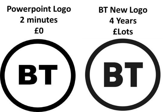
And they may have a point: If a new corporate identity can be replicated in PowerPoint using Ariel Black by a design muppet like me in under two minutes, is BT’s design agency Red&White really earning their undoubtedly significant fees?
Well, they would no doubt have created hundreds of more thrilling concepts before this version was selected and ultimately delivered an approved logo to a presumably happy client so it’s only fair to concede that they did everything asked of them.
That said, does it even matter? Who needs a flashy logo anyway? Will it ultimately affect BT’s bottom line if products, services, customer-centric strategy and delivery and employee motivation are on point?
In the same press release as the logo announcement, BT’s CEO Jansen revealed a new loyalty and rewards initiative, awarding £50m of shares to employees which gives each member of staff stock worth £500 per year.
Employees at the forefront of a business’s future success? It doesn’t take a clever logo to make significant and impactful changes to a company, no matter how big.